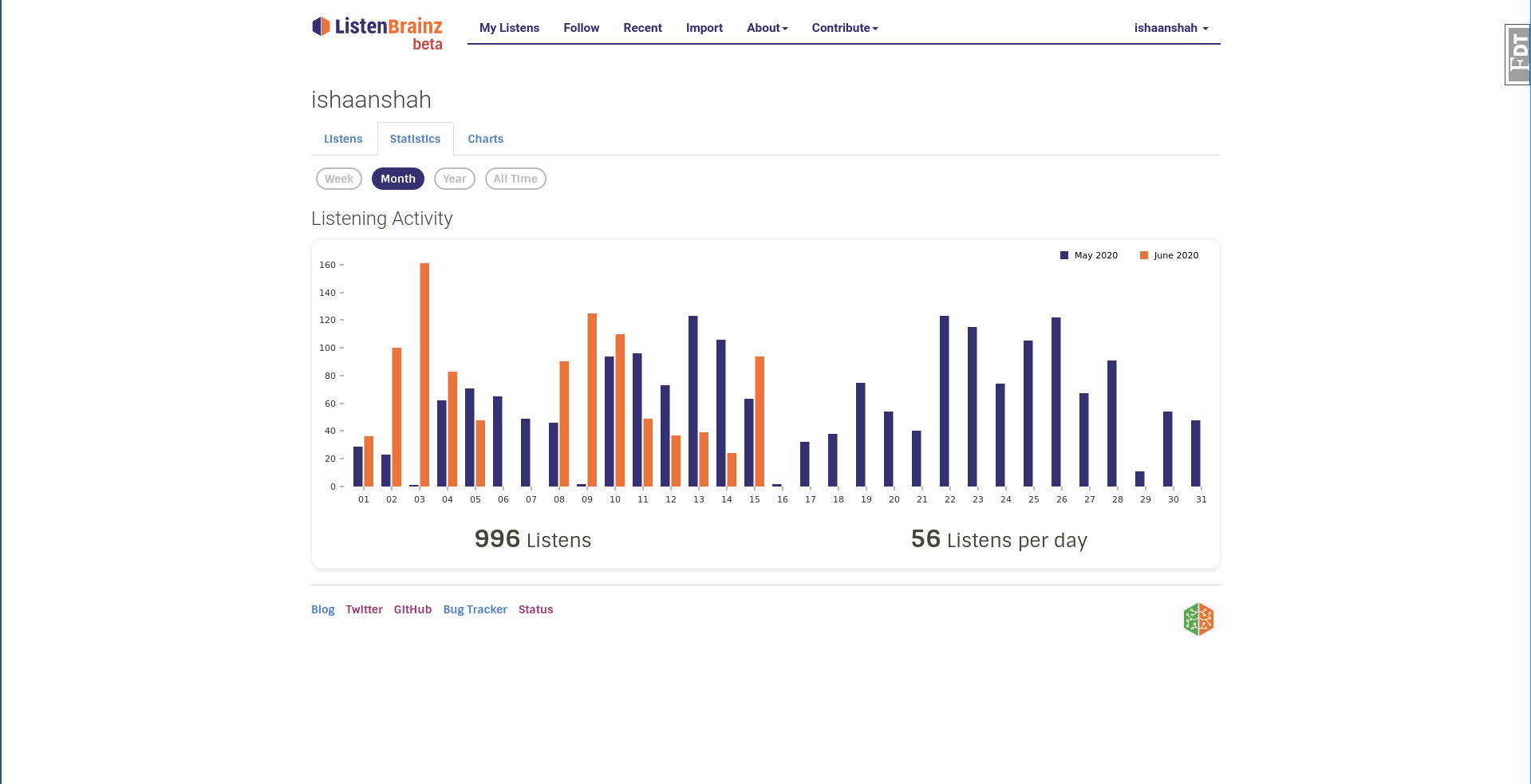
Cause comparison with last months data is not as obvious as grouped?
2020-07-01 18359, 2020
iliekcomputers
yes
2020-07-01 18323, 2020
ishaanshah
Hmm thats what bothered me too, but was worth a shot
2020-07-01 18354, 2020
ruaok
is the comparison view really that important? for financial info, yes. but for my listen history?
2020-07-01 18331, 2020
ruaok
I think that bar graphs for just the single month actually works well. and if the comparative view makes it dificult, it makes me wonder why we have the comparative view.
2020-07-01 18337, 2020
D4RK-PH0ENiX has quit
2020-07-01 18310, 2020
shivam-kapila
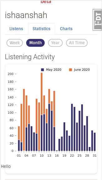
ishaanshah: Isnt a line graph not feasible here. I mean a continuous one?
2020-07-01 18319, 2020
shivam-kapila
without those dots for each day
2020-07-01 18346, 2020
shivam-kapila
I would like to picturise it
2020-07-01 18306, 2020
shivam-kapila
data over a range as something continuous and not discrete bar graphs
2020-07-01 18331, 2020
D4RK-PH0ENiX joined the channel
2020-07-01 18350, 2020
ishaanshah
ruaok: We are skipping comparison view for monthly statistics on mobile view, I think the comparison is cool though because it lets me see if listened to more/less music in the last time period and pick up the pace if needed :P
2020-07-01 18316, 2020
ishaanshah
shivam-kapila: The line graph doesn't work for monthly data
2020-07-01 18323, 2020
shivam-kapila
Why?\
2020-07-01 18327, 2020
ruaok
I understand that it is cool -- the question is, is it cool enough for us to make our lives more difficult?
2020-07-01 18327, 2020
shivam-kapila
30 points?
2020-07-01 18337, 2020
ishaanshah
Gets too crowded
2020-07-01 18307, 2020
shivam-kapila
Do you have a screenshot?
2020-07-01 18328, 2020
ishaanshah
Unfortunately I don't :(
2020-07-01 18356, 2020
shivam-kapila
Because those bar graphs look too complicated and dont convey the informat at a glance
2020-07-01 18311, 2020
shivam-kapila
I may be wrong though
2020-07-01 18339, 2020
ishaanshah
> I understand that it is cool -- the question is, is it cool enough for us to make our lives more difficult?
2020-07-01 18339, 2020
ishaanshah
Skipping the last month on mobile is not hard, I have already written the code for it
2020-07-01 18339, 2020
jmp_music joined the channel
2020-07-01 18359, 2020
shivam-kapila
ishaanshah: Were those 30 dots too crowded or were the crests and troughs too much zig-zaggy?
I'd say maybe a bit more vertical spacing between the tabs and more padding
2020-07-01 18307, 2020
Mr_Monkey
Mind if I do?
2020-07-01 18311, 2020
ishaanshah
Again, it doesn't look good in mobile mode
2020-07-01 18324, 2020
shivam-kapila
Mr_Monkey: Please go ahead
2020-07-01 18343, 2020
shivam-kapila
ishaanshah: Lets discuss this in 5 minutes. Can we?
2020-07-01 18319, 2020
Mr_Monkey
shivam-kapila: I like the smaller tabs you had a bit more in top section. What do you think?
2020-07-01 18329, 2020
Mr_Monkey
Yeah, that looks good
2020-07-01 18303, 2020
shivam-kapila
Agreed
2020-07-01 18313, 2020
shivam-kapila
NOw that starts lookin' goood
2020-07-01 18343, 2020
shivam-kapila
Finallly! the ugly nav thing is gone. Yippeeeee
2020-07-01 18353, 2020
shivam-kapila
Thanks Mr_Monkey <3
2020-07-01 18313, 2020
Mr_Monkey
Well, I think you did all the work, I just gave my opinion
2020-07-01 18311, 2020
shivam-kapila
That orange line appeals only to the extent it needs to
2020-07-01 18335, 2020
shivam-kapila
Shall we finalise these now
2020-07-01 18346, 2020
Mr_Monkey
I think some of the fine-tuning with spacing, padding, font-size, etc. can be adjusted when we have the actual components. To me this looks good, consistent in design and functionality with your original side bar. That seems like a success
2020-07-01 18314, 2020
shivam-kapila
yes those will be tuned for sure
2020-07-01 18337, 2020
shivam-kapila
> Well, I think you did all the work, I just gave my opinion
2020-07-01 18337, 2020
shivam-kapila
Whats UI/UX without opinions ;)
2020-07-01 18313, 2020
Mr_Monkey
Easier? XD
2020-07-01 18336, 2020
shivam-kapila
haha XD
2020-07-01 18323, 2020
shivam-kapila
Lets finalise this and turn it to code. I am now seeing this coming out
2020-07-01 18347, 2020
Mr_Monkey
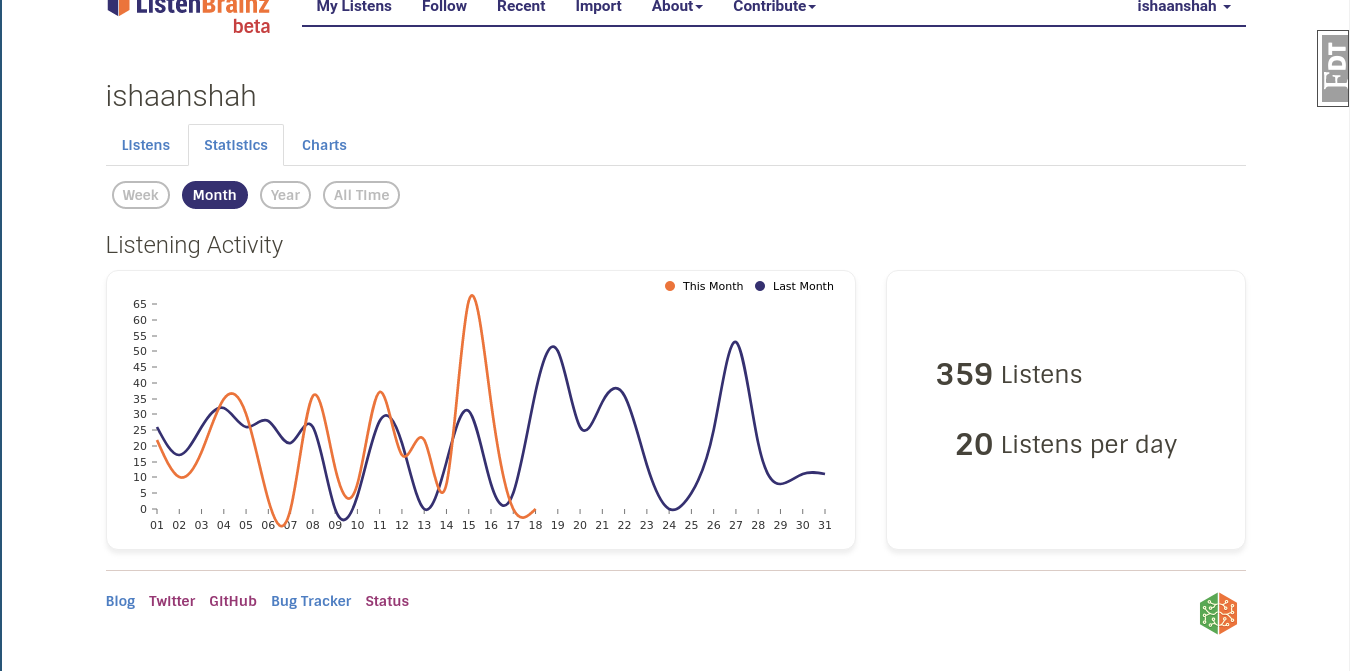
As far as I'm concerned, this ticks all the boxes. Clean and modern, multiple levels of navigation that don't look at odds with each other, obvious UX. https://usercontent.irccloud-cdn.com/file/DC8RqMT…
2020-07-01 18309, 2020
shivam-kapila
Sweet I would say
2020-07-01 18320, 2020
Mr_Monkey
Quite. Good job
2020-07-01 18326, 2020
ruaok
ohh, yes. very good.
2020-07-01 18331, 2020
ruaok
+10
2020-07-01 18320, 2020
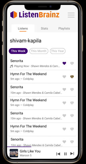
shivam-kapila
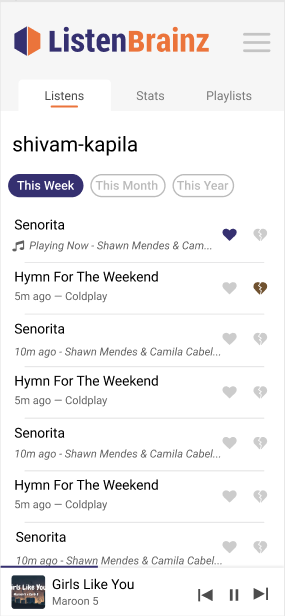
Mr_Monkey: Any opinions on cards for listens list
2020-07-01 18357, 2020
Mr_Monkey
I'll be honest, I could go for either. To me they both look good.
2020-07-01 18313, 2020
Mr_Monkey
What happens if a user 'clicks' on a card?
2020-07-01 18344, 2020
shivam-kapila
Not for now but this will look good when we impliment "Click to view metadata"
2020-07-01 18359, 2020
Mr_Monkey
I suppose my underlying thought is that a card is an invitation for a user to click on
2020-07-01 18323, 2020
Mr_Monkey
So if something is supposed to happen, cards are probably better.
2020-07-01 18325, 2020
shivam-kapila
Dont we want that in near future>
2020-07-01 18328, 2020
shivam-kapila
?*
2020-07-01 18349, 2020
Mr_Monkey
I think so. For seeing more data as you say, clicking on it to play it, etc.
2020-07-01 18304, 2020
shivam-kapila
Plus cards will go good with when we have that "3 dot menu"
I think we moved close to make it have an app like feel in the browser
2020-07-01 18310, 2020
shivam-kapila
CatQuest: Are your contrast issues addressed too?
2020-07-01 18326, 2020
shivam-kapila
ishaanshah: Are you free to ponder over the possibilities?
2020-07-01 18304, 2020
shivam-kapila
ruaok: I missed the meeting for planning. When shall we do it?
2020-07-01 18321, 2020
D4RK-PH0ENiX has quit
2020-07-01 18359, 2020
D4RK-PH0ENiX joined the channel
2020-07-01 18333, 2020
ishaanshah
shivam-kapila: Hi, I would be happy to ponder over possibilities for Bar chart as I feel line charts are not meant for showing this kind of data and I don't think I have the capacity to spend another day porting from bar graph to line graph.
2020-07-01 18355, 2020
shivam-kapila
I understand
2020-07-01 18327, 2020
ruaok
shivam-kapila: later today, I'm in the middle of banking guff
2020-07-01 18339, 2020
shivam-kapila
Sure thing
2020-07-01 18356, 2020
iliekcomputers
ishaanshah: hey
2020-07-01 18308, 2020
iliekcomputers
I say we should move forward with what we agreed on initially
2020-07-01 18310, 2020
shivam-kapila
ishaanshah: You may move forward as you are going on. You are already doing good. I understand the effort will go futile if we go on pondering over line charts