jmp_music: what features is the sklearn version using?
2020-06-29 18109, 2020
shivam-kapila
ruaok: Meanwhile can yopu look at Desktop Concept 2 -- how do the cards go listen line
2020-06-29 18112, 2020
shivam-kapila
list*
2020-06-29 18143, 2020
jmp_music
alastairp: well, I follow a little but different preprocessing procedure compared to gaia, till now. I use all the numerical features, and I enumerated the categorical ones too. After that, I let PCA to decide which features are highly correlated and cover the 95% of the dataset's variance.
2020-06-29 18154, 2020
shivam-kapila say Mr_Monkey going to DC2
2020-06-29 18157, 2020
shivam-kapila
saw*
2020-06-29 18117, 2020
ruaok
sorry, what should I be looking at in DC2?
2020-06-29 18136, 2020
shivam-kapila
The list of listens
2020-06-29 18146, 2020
shivam-kapila
Each listen is in a card
2020-06-29 18156, 2020
jmp_music
alastairp: gaia uses different procedure. It checks the mfcc, it deletes some of the numerical too, but I experimented with all the features to see what the results will be
2020-06-29 18157, 2020
shivam-kapila
Rather than separated by horizontal line
2020-06-29 18102, 2020
ruaok
looks fine to m.
2020-06-29 18154, 2020
Mr_Monkey
As far as I'm concerned, I think the two best options are side bar 2 and combined nav. I find MP 3 to 6 confusing one way or another.
2020-06-29 18103, 2020
jmp_music
alastairp: That's what i saw in the config file. gaia checks and tests all the possible methods
2020-06-29 18119, 2020
jmp_music
both in scaling, and the feature selection
2020-06-29 18136, 2020
shivam-kapila
Mr_Monkey: Thats the only problem. Confusion
2020-06-29 18111, 2020
Mr_Monkey
I think the options that is most unambiguous, easiest to implement and saves screen real-estate (scrolls out of view) is the combined nav
2020-06-29 18113, 2020
Mr_Monkey
Or, to be more precise, not combining the bootstrap hamburger nav and the side bar nav, but on mobile always show the side nav on top, not collapsible.
2020-06-29 18127, 2020
jmp_music
alastairp: That's why I decided to not adopt a static method, but let PCA decide dynamically the best features at each training phase, based on the nature of the dataset. I want now to implement gaia's static feature selection too, to compare with my previous skleran implementation.
2020-06-29 18143, 2020
alastairp
jmp_music: great. as our initial goal is to completely replicate the gaia results, the static feature selection looks like a good next step
2020-06-29 18104, 2020
shivam-kapila
Mr_Monkey: I got you
2020-06-29 18132, 2020
ruaok
I agree that in mobile, the sidebar doesn't work -- the horizonal space is too precious.
2020-06-29 18108, 2020
jmp_music
alastairp: cool! When I reach that step, I would like to ask you which type of scaling gaia uses for normalization, and guassianization on data scaling. But first let me check the cpp code
2020-06-29 18127, 2020
jmp_music
alastairp: I found the code inside the algorithms directory
2020-06-29 18117, 2020
jmp_music
Additionally, I saw that gaia triggers PCA only when the features selection is above 80!
2020-06-29 18134, 2020
jmp_music
that's in pca.cpp file
2020-06-29 18108, 2020
alastairp
oh cool, I didn't even know that gaia does pca!
2020-06-29 18121, 2020
shivam-kapila
Mr_Monkey: Can you look at mine one
2020-06-29 18128, 2020
alastairp
for the normalization and gaussianization it will be best if you look at the code
2020-06-29 18125, 2020
Mr_Monkey
shivam-kapila: So something like that can work I think
Not sure you need the white tab to have space above it, and considering you already have the section title (recent listens) you can avoid repeating it just underneath
2020-06-29 18154, 2020
ruaok
that whole line is a bit odd to me -- a lot of space dedicated to just showing a name.
2020-06-29 18127, 2020
ruaok
but overall this design is starting to grow on me.
2020-06-29 18144, 2020
shivam-kapila
ruaok: how to indicate user_name then?
2020-06-29 18125, 2020
shivam-kapila
Mr_Monkey: that space is something I like 😬
2020-06-29 18126, 2020
ruaok
thats just it, I don't have better suggestion.
2020-06-29 18101, 2020
ruaok
also, the word Beta take up extra space. maybe time to get rid of it?
2020-06-29 18128, 2020
shivam-kapila
we may move that beta with timescale migration
2020-06-29 18136, 2020
shivam-kapila
remove*
2020-06-29 18159, 2020
ruaok
yeah, when we have rolling releases on a frequent basis, what does beta even mean?
2020-06-29 18128, 2020
shivam-kapila
beta == son in hindi😛
2020-06-29 18154, 2020
shivam-kapila
Mr_Monkey: Waana give some final touches and then we code it out?
2020-06-29 18127, 2020
shivam-kapila
ruaok: you too please
2020-06-29 18157, 2020
jmp_music has quit
2020-06-29 18103, 2020
ruaok
final comments?
2020-06-29 18120, 2020
shivam-kapila
touches comments all work
2020-06-29 18126, 2020
ruaok
I dont think I have any. LGTM.
2020-06-29 18153, 2020
shivam-kapila
One question -- Do we keep those icons in sidebar in desktop mode?
2020-06-29 18106, 2020
jmp_music joined the channel
2020-06-29 18112, 2020
Mr_Monkey
Yes
2020-06-29 18124, 2020
Mr_Monkey
If we use them in one view we use them in the other, for consistency
2020-06-29 18153, 2020
Mr_Monkey
Probably right-aligned in desktop side bar
2020-06-29 18137, 2020
shivam-kapila
DC1 looks cool
2020-06-29 18147, 2020
shivam-kapila
Not sure if its to be orange though
2020-06-29 18157, 2020
Mr_Monkey
shivam-kapila: Either of those tab options would work for me. I see where the design with the rounded tab comes from, but I think in this view it's distracting (no used to see tabs quite like that)
alastairp: Cool! The enumeration I do in sklearn, is exactly applied to the same features as gaia does. I'll ask you for the rest ones if I find any difficulties. Thanks!
2020-06-29 18119, 2020
ishaanshah
ignore the overlap below
2020-06-29 18125, 2020
ishaanshah
gonna fix that tomorrow
2020-06-29 18105, 2020
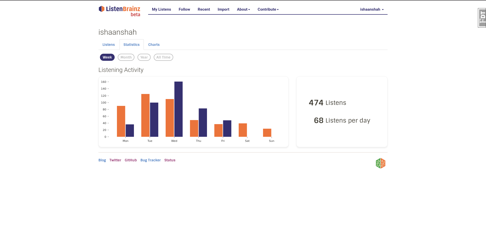
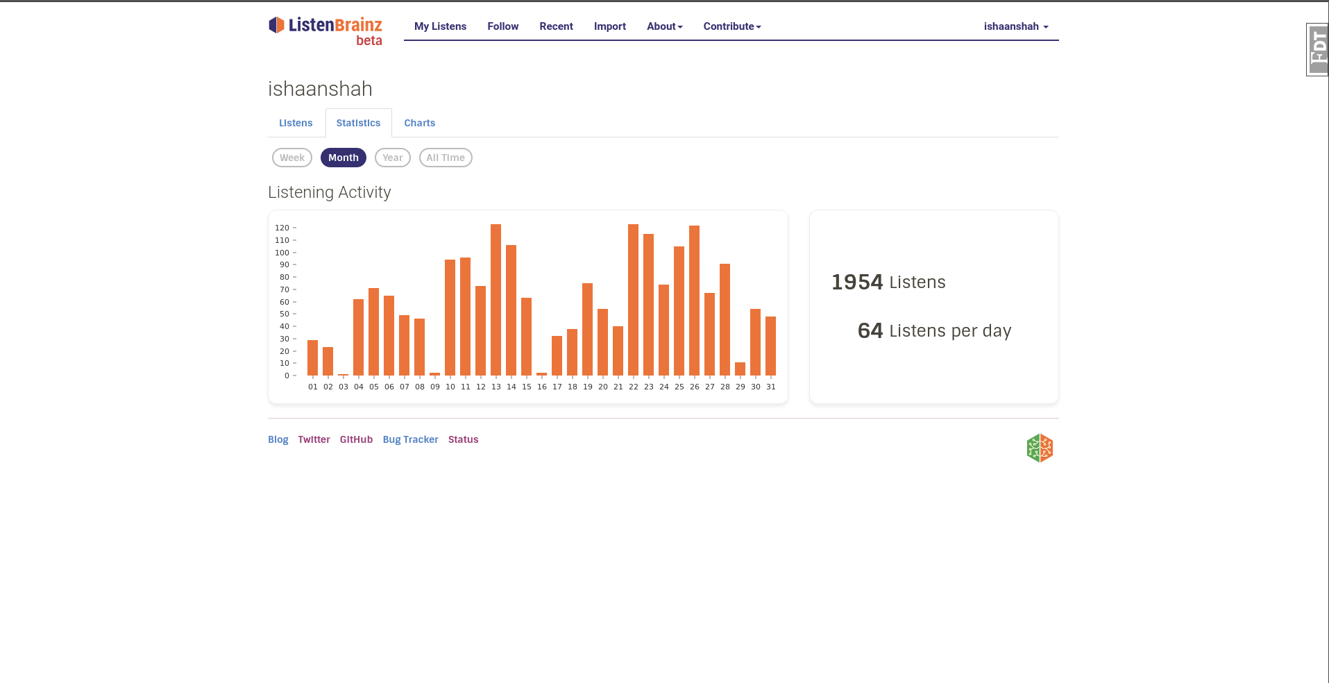
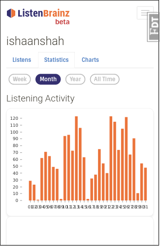
ishaanshah
> Could we put that on a horizontal line and then use the newly freed up space for the graph
2020-06-29 18105, 2020
ishaanshah
We do that on mobile, still doesn't fit as shown in the screenshot above
2020-06-29 18101, 2020
ishaanshah
So there are two things we can do
2020-06-29 18103, 2020
iliekcomputers
Hmm
2020-06-29 18115, 2020
ishaanshah
One is convert it to a stacked bar graph
2020-06-29 18126, 2020
ishaanshah
Or skip last month for monthly stats
2020-06-29 18143, 2020
ishaanshah
I am inclined towards the second
2020-06-29 18146, 2020
ishaanshah
option
2020-06-29 18147, 2020
iliekcomputers
We could also make the graph vertical
2020-06-29 18110, 2020
ishaanshah
That would eat up too much space
2020-06-29 18121, 2020
ishaanshah
We also have other stats below
2020-06-29 18159, 2020
iliekcomputers
Skip last month for monthly stats on mobile then
2020-06-29 18125, 2020
ishaanshah
I think we should skip it for desktop too
2020-06-29 18141, 2020
iliekcomputers
Why?
2020-06-29 18157, 2020
ishaanshah
the bars already look too thin IMO
2020-06-29 18108, 2020
iliekcomputers
If we add the space from the card, they won't.
2020-06-29 18129, 2020
iliekcomputers
The data is interesting, I want to see it 🤷🏽♂️
2020-06-29 18143, 2020
ishaanshah
Hmm, that makes sense
2020-06-29 18104, 2020
ishaanshah
So essentially it will two row layout for both mobile and desktop right?
2020-06-29 18136, 2020
iliekcomputers
Right, and the first row (listens per day etc) doesn't need to be very tall.
2020-06-29 18114, 2020
yvanzo
bitmap, reosarevok: Updating mb.o website/web service containers.