akshaaatt: rishav_a2z: oops sorry, I got this mixed up with the similarity graph one. I think the profile page mockup does still need work, based on the feedback. I’m not sure if the existing LB site and functionality has been considered fully, though the basic layout makes sense
rishav_a2z: Why would we not use the desktop listen card style? Why make a new one?
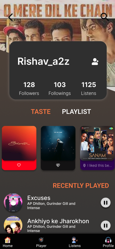
I like the album image at the top a lot! If the user can control this (e.g. via last pinned song) it’s a nice piece of customization
rishav_a2z
User can control it. What i thought is to show the album image of top played album that week.
But we can also go with pinned track
aerozol
We have to be careful, because I could end up listening to a lot of goregrind one week but not necessarily want a gross picture as my profile
About the listen card style we can go with existing card, i have a random thought to put all icon together may look clutter in phone. But yeah.
Like you are login and you saw your profile so you will see all the playlist, public, private and collaborative. While other user who visit your profile will only see the public one
aerozol
We can definitely change it for mobile, it doesn’t have to be exactly the same. But you should be making a LB product
That sounds good re. playlists - I just don’t see any of that in the mockup or the proposal
rishav_a2z
Yeah. So i will try with the existing one. I will put it there
aerozol
Put it there, with any changes needed to make it work for mobile ;)
But it is the starting point
rishav_a2z
Yeah sure. Bhaiya.
About the mockup i didn't specify about the playlist because i thought that is normal. Sorry for that.
aerozol
Not everyone thinks about details like that, so it’s good to show that you have. If you only want to do one mockup/image I would show the most complicated version - showing just public playlists is easy, but what’s the UX when we have personal and collaborative playlists to choose from, that’s more interesting
jasje: You mentioned a desktop loading icon for LB? Where is it :P
ooh 2am in India already, sorry
leaveitblank
only 2am
rishav_a2z
Also bhaiya. To give filter like tag in taste for like dislike and pinned is okay? Or need to do any change
Its been a week i slept before 4 now:|
aerozol
Honestly, everyone in India lives on no sleep!! Hope you’re all looking after yourselves :-0
rishav_a2z
Giving full try for that. The most hectic part is to go college and learn what happen when 2 wire connects to each other😑😑
aerozol
I don’t quite understand that taste picture rishav_a2z. Is that with a pill button selected? And then the matching items underneath? And Recently played has been replaced or bumped further down
rishav_a2z
Its like the section. When user click on it a new section will open. With that it only show the matching item like by default loved music will come. Recently played will be replaced
aerozol
Okay, so it’s a bit different to playlist which leaves the Recently Played section below?
rishav_a2z
Recently played section will not be there. In link when you click on taste complete new section will come
But I don’t want to be getting into too many details myself - your job is to show us you can listen to feedback and consider it without hand-holding. My feedback is basically that you could show more clearly that you’ve thought about possible UX/UI issues, and that you thoroughly understand how LB desktop/the required functions work
rishav_a2z
Okk sure.
aerozol
re. visuals, you’ve kept a diagonal, so if there’s a reason for that make sure to let me know. In your Taste mockup you have a different pill style to what we use in ListenBrainz - maybe this comes from somewhere in the app that I can’t find? Otherwise just clone the LB design figma and use the pill buttons from there (and styles, last played cards etc)
aerozol: ^ maybe you can attach that as an extra to the minutes :)
monkey: sorry, I wasn't running this today and I guess mayhem doesn't have access to the community-manager email
aerozol
reosarevok: roger
hah, I didn’t know about this one: tastebuds.fm
Dating site that uses last-fm information + location information. According to reddit it doesn’t work that well, but still a great idea! If you want to date a music nerd/elitist, anyway :P
tastebuds is a great name, apparently they’re going to pivot away from dating and more towards just making friends, which makes sense to me
reosarevok: I’ll deal with forum flags as they come up, while you’re on holiday? Let me know if you don’t want me to
jasje: akshaaatt: I like the graph animation and the new slider effects, but I think we need to start being careful about doing animation for animations sake. Or the LB app will start to look like a personal portfolio. Keep this design mantra in mind: “form follows function” - figure out what we want to do or show better (the function), and then making it look super nice and then interaction super smooth (the form) comes
after that. But function comes first
jasje: akshaaatt: I like how the graph animation and the sliders look, but I don’t see how they makes life better/easier for our users. Not to say we shouldn’t use them, just let’s make sure to think of function *first*!
reosarevok
aerozol: if you can be bothered :) Delete users as needed + mark as spam in MB
aerozol
jasje: loading animation is different, because its function is literally just to look nice/distract the user haha, which makes it fun
reosarevok: on it!
trolley has quit
trolley joined the channel
monkey: oh man I had the dumbest thought about how we could fix that LB secondary menu gradient problem! You’ll love it! We put some padding on the end of that menu, and then when you scroll all the way to the right there’s *another* layer right on top, that goes on top of the scroll gradient! Or, more sensibly, we put some padding on the end, and make the scroll gradient the same colour as the background… fun times