but that's it. why add a big blob of colour that is so distracting. whne a small one with gradient woudl do the trick and look stylish
!
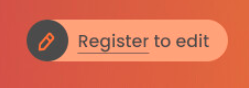
this is a button though
kepstin
yeah, that's about orange as a background
CatQuest
i don't have a provlem wih reading the orange text on mb tbh
aerozol
Ah, right, I can live with something like that
CatQuest
the magenta is a ig too bright, but i got usedto it
aerozol
As part of the redesign I would like to visit how we can signpost where things sit. E.g. if you're in a release page it's clearer it's in a release group
Because it's obvious to us but not necessarily for others
CatQuest
actually bookbrainz needs that more thna mb
yeai had an idea for that!
but you're not gonig to like it
aerozol
Absolutely, I can't even make sense of that tbh
Hit me with it!
CatQuest
my idea was to use a small colourful header background, a spesific colour for each entity type
the colour would be mutd. liek edit type backgrounds too
kepstin
ah, https://www.myndex.com/BPCA/ might be useful - it's a colour checker using updated algorithms that otherwise can be used in a WGAC compatible way.
CatQuest
but this colour would still work with black text
aerozol
Not a bad idea, but unless you already know what the colour means it doesn't necessarily help
CatQuest
or erh 95%
aerozol
thanks kepstin!
CatQuest
in this case we will decide what each colour means and stick with it
eventually peopel will get used ot "this colour menas this entity" and it wil lbe a usefull hlep every day
aerozol
ooh that looks good kepstin
Do experienced editors really get lost though CatQuest? The icon's there too
kepstin
lol, musicbrainz orange only gets a 2.7:1 in that :(
CatQuest
no they don't. but the colour can't hurt
also on mb i'd love this becase i *do* get a bit lost and i've been using bb since it was written in haskell
on bb i'd love that*
aerozol
we can definitely use colours to help, I'll have to think about it
CatQuest
anyway if will be useful for people who are for whatever reason turning of images
aerozol
Discogs hasn't really cracked it, but their list of other versions at the bottom does make it more obvious that there's a bunch of them at least
CatQuest
in my oppinion rg and release pages are diffenough on mb
So for a new user clicking to a release page, how do you see them understanding how MB works?
CatQuest
hmmm
yyg7g76g joined the channel
see what I *would* do, is write a some kind if illustrated, maybe fun or interactive wizard for the new user. that will show via images and interactive how things look and work with descriptive blurbs and the like
then on the real page I would have all explanation blurbs expanded
aerozol
A wizard is great for someone who's signed up but I think we can improve things just by changing the page a bit
CatQuest
and this wizard woudl b the first thing an new user is ofered
aerozol
But heck, maybe it's too hard
Just good to think about
CatQuest
yea
also i would have: differnt views for differnt users
aerozol
I do love wizards
CatQuest
a differnt view for homeone logged out, and for the newbie and for the user and for the power user
aw man they cna be great! (as long as they're optional not unskippable :D)
if you're interested, I wrote a lot of comments on the chaavi tickets in jira
for a newbie things should be simplistic, don't show hugeass editor riht away
for the regular users yhave bits that can be expanded or colapsed
for the power user, let's have the abiltiy to do crazy things like merge recordings and whatnot
aerozol
yeah! that's what I meant with having editor tools at the top as well
CatQuest
all customisabl for the user's needs
editor tool?
aerozol
as long as they can be collapsed and don't show for everyone it's definitely not a bad idea
all your tabs
CatQuest
i even thoguht of it liek this: once a person is no longer a "newbie" user type but a regialr user, show thme a "congradulations! you've now become a regualr users! now yo ucna vote and comment on other editors edits, and you shoudl be more comfortable editing, there are lots of tools mb cna provide blah balh and show thme some more interactive guide things for advanced stuff
aerozol
Someone not logged in can just see a pencil at the top of the page, that's all they really need
editing is a primary purpose of the pages after all
aerozol
(click the download link again sorry)
CatQuest
tbh, on discids, and coverart and aliases they yo ucn also "modifydata"
kepstin
the fact that you can use musicbrainz to view information from the db is secondary to it's primary feature of being able to edit it, imo :)
CatQuest
[22:58] <kepstin> editing is a primary purpose of the pages after all <-- that
infact what page cna yo u*not* change a thing on?
aerozol
I go to cover art, and then there's a 'button' to edit
CatQuest
overfiew i guess
aerozol
not a tab to edit
We could make a 'Add cover art' tab
CatQuest
there is an unswerscript to turn it to "cover art" into a "add coverart"
kepstin
aerozol: that's a tricky one, because the cover art page is a list of cover arts, and each art is individually editable
CatQuest
as long as there is no such added
yes
kepstin
it could go direct to "add cover art" screen if there is none, tho
CatQuest
personally if there is 0 coverart I'd say the tab shoudl go directly to add CAA but once there is anything, show the now page
aerozol
I'm being facetious sorry, if we put every 'edit' button from all those pages into the tab it will be crazy :P
CatQuest
lol jinx kepstin
aerozol
There is a script from jesus that makes that tab go straight to add CAA if there isn't one, but I forget which one and it doesn't always work for some reason
CatQuest
anyway my script adds edit rels annotation and edit history, and there is still room for a couple more
yea i used ot have it too but it stopped working some time so now i have to click twice
aerozol
But once in the cover art tab, 'add cover art' is a button
CatQuest
yes!
aerozol
Not a tab
CatQuest
but the distinction is irrelevant to all but designers
kepstin
aerozol: note that the full APCA contrast calculator (without the WCAG compat) is here: https://www.myndex.com/APCA/ that includes a neat feature where it shows you the minimum font size the color combination is usable at for different font weights.
aerozol
Yeah, all the questions in the forums from people not able to perform basic tasks because the UI isn't clear doesn't testify to that
They're not designers
revi has quit
revi joined the channel
CatQuest
sorry i was being flippant,
I didn't mean it like that
aerozol
I know! But also I do want to reinforce that I'm not just wanting to make things look pretty for no reason
CatQuest
but comming back to colours, if it's an "add coverart" "button" it could have a different coloiur tna if it's just a "link" to the "view coverart" page
aerozol
yeah those distinctions would be great. "hi GSoC person, if it does this make it it a tab, if it does this a button"