Hi, can someone please link me to any piece of documentation on MusicBrainz that explains canonical MBIDs?
2022-10-21 29447, 2022
Pratha-Fish
^ CC alastairp
2022-10-21 29404, 2022
lucifer
Pratha-Fish: afaik, there's no such documentation.
2022-10-21 29421, 2022
Pratha-Fish
F
2022-10-21 29448, 2022
lucifer
canonical MBID isn't a MB concept but mayhem can probably give a brief explanation of the concept
2022-10-21 29402, 2022
mayhem
sure.
2022-10-21 29415, 2022
mayhem
we've got the concept of a release-group, yes?
2022-10-21 29432, 2022
mayhem
a release group may contain one or more versions of a given release.
2022-10-21 29456, 2022
mayhem
how do you know which one is the "most representative" of those?
2022-10-21 29415, 2022
chinmay
monkey: thankyou!
2022-10-21 29416, 2022
chinmay
yess, I can try `display: flex` (with `wrap`, right?)
2022-10-21 29428, 2022
chinmay
mayhem: that looks awesome!
2022-10-21 29428, 2022
mayhem
there isn't a good way to pick one. so we mainly go with the first digital version and call that the canonical release in a given release group.
2022-10-21 29440, 2022
chinmay
I was working on fixing the mobile and tablet layouts. On that topic, can you check the mobile layout? (hint: filters)
2022-10-21 29440, 2022
chinmay
aerozol suggested a collapsed floating filter button yesterday. I was thinking that we can have the expanded filter layout at the start of the page and it collapses into a floating filter button while scrolling. I did some googling but I can't think of a logic for this one yet :p
2022-10-21 29450, 2022
monkey
Probably not with wrap. This is for the three column layout (filters, release grid, slider) so we don't want them to wrap
2022-10-21 29403, 2022
chinmay
monkey: alright
2022-10-21 29404, 2022
monkey
I think the release grid works well as-is.
2022-10-21 29406, 2022
mayhem
so then for each recording that appears on a canonical release, those recordings are considered canonical.
2022-10-21 29414, 2022
monkey
I mean with css grids
2022-10-21 29440, 2022
mayhem
all other recordings that appear in the releaese group that do not appear on the canonical release are non-canonical.
2022-10-21 29445, 2022
chinmay
css grids scare me
2022-10-21 29447, 2022
mayhem
Pratha-Fish: does that make sense?
2022-10-21 29407, 2022
monkey
I mean… I think you did good with the current layout, don't you think so?
2022-10-21 29414, 2022
chinmay
I always mess it up when I start using css grids
2022-10-21 29428, 2022
chinmay
its because of bootstrap tho
2022-10-21 29449, 2022
mayhem
aside from improving round-off errors and improving the handling of non-square images, I'm quite happy with this approach.
Also while we're at it, how long would it take to publish a blog on blog.metabrainz.org once the final draft is ready?
2022-10-21 29440, 2022
mayhem
just press the button and done.
2022-10-21 29411, 2022
chinmay
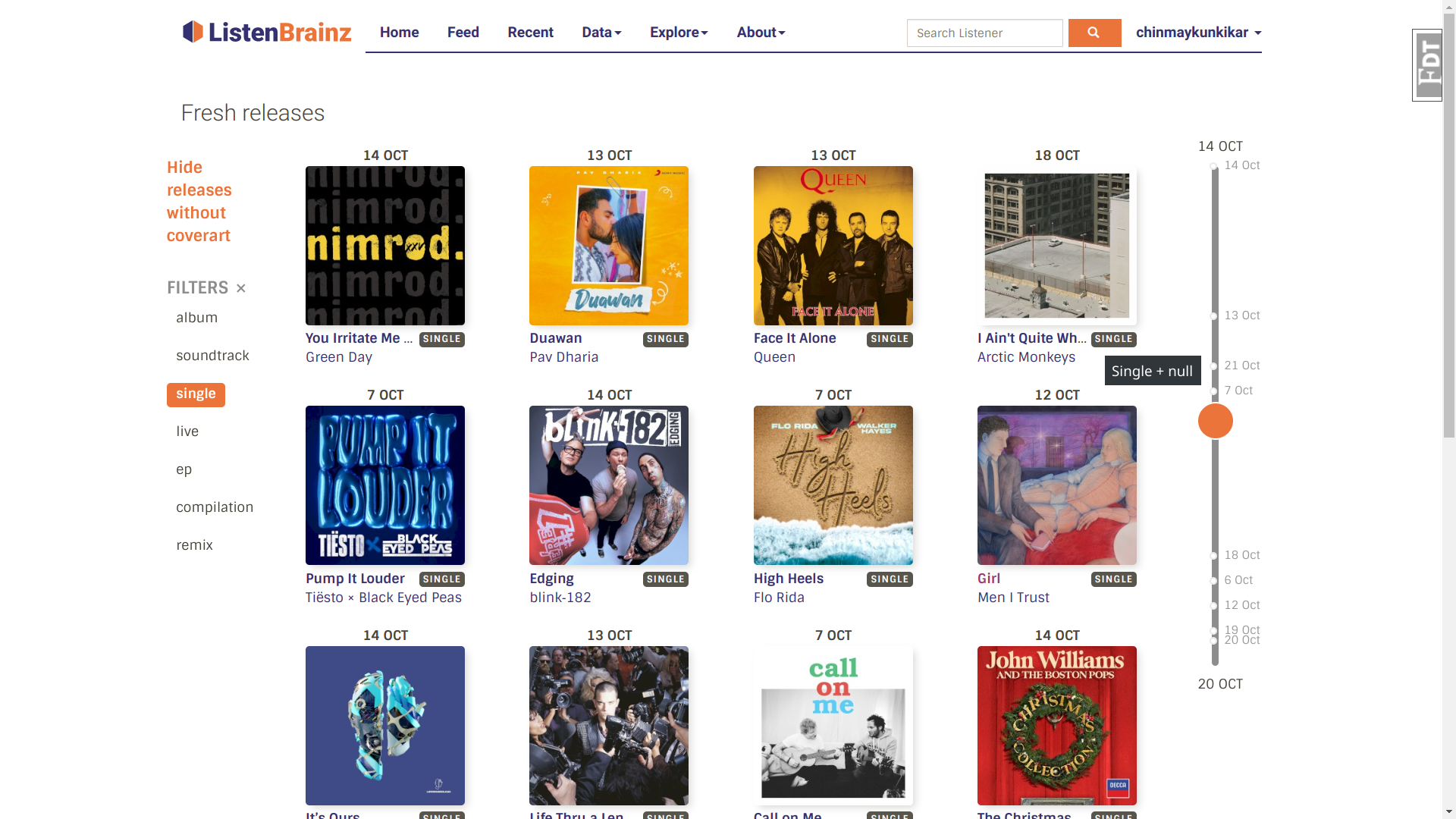
lucifer: the user fresh releases work :) I noticed that the user and sitewide responses have different required fields like the `release_group_secondary_type` and `caa_id`. https://usercontent.irccloud-cdn.com/file/lu7GKQo…
The filters look pretty good to me chinmay. Perhaps we could have the slider horizontal and under the filters on mobile?
2022-10-21 29451, 2022
monkey
The collapsible floating button would take a bit more time to figure out, but it's doable. We use a library for drag and drop of the youtube video player (react-draggable), in case that could help with the floating button (not sure we want to move it around, but thought i'd mention it)
2022-10-21 29458, 2022
alastairp
Pratha-Fish: it's getting later here, but I'm more or less around if you get something to me today
yes confidence is extra in user ones. and the release group type is sometimes omitted from sitewide ones (not sure why, i'll make them mandatory). but everything else should be same
ah no that's not what i meant. if you mark as optional, the key will still appear but with the null value.
2022-10-21 29459, 2022
chinmay
oh
2022-10-21 29417, 2022
lucifer
the to_dict just below explicitly deletes the key if its null due to which its not always present.
2022-10-21 29445, 2022
lucifer
but i am wondering why delete it all because we usually don't do that.
2022-10-21 29406, 2022
chinmay
ooo understood
2022-10-21 29435, 2022
chinmay
my only concern was that the schema were not consistent
2022-10-21 29418, 2022
lucifer
yes, i think you can use the sitewide releases schema + add an optional confidence field to it.
2022-10-21 29428, 2022
lucifer
that should work in all cases.
2022-10-21 29405, 2022
chinmay
if you see the screenshot above for user releases you'll see "Single + null" on the tooltip
2022-10-21 29428, 2022
chinmay
wait let me try something out to make it consistent
2022-10-21 29441, 2022
lucifer
i see. yeah you'll have to add an if check for that.
2022-10-21 29446, 2022
chinmay
okay
2022-10-21 29448, 2022
chinmay
monkey: I was thinking a horizontal top/bottom sticky timeline as well :)
2022-10-21 29456, 2022
chinmay
i don't think we need to move the filter button around. bad ux in this case
2022-10-21 29435, 2022
monkey
Certainly doable. I started writing something up about how to use flexbox to go from columns to rows layout, maybe even how to reorder the rows if needed, but then I realized we would need to make the slider horizontal, which means using media queries in the react component. Certianly doable (it is used in a couple of places in the codebase) but I just don't like the idea :p
2022-10-21 29449, 2022
monkey
But if that's the only solution…
2022-10-21 29455, 2022
monkey
or the best
2022-10-21 29409, 2022
monkey
P.S: I think you could have two covers per row in mobile view, rather than one. I think there's enough space
2022-10-21 29426, 2022
monkey
And that means a more usable page with half the scrolling :p
2022-10-21 29420, 2022
lucifer
monkey: when you have time, i have put the image without node_modules on beta for testing.
2022-10-21 29452, 2022
lucifer
pages seem to load fine and i was able to view source maps as well. not sure what else to test.
2022-10-21 29458, 2022
chinmay
monkey: "but I just don't like the idea" which idea exactly? :p
2022-10-21 29426, 2022
monkey
Using media queries in JS
2022-10-21 29427, 2022
chinmay
you're right, there's plenty space for two cols
2022-10-21 29434, 2022
chinmay
oh that
2022-10-21 29444, 2022
chinmay
I dislike that too
2022-10-21 29447, 2022
monkey
will test lucifer
2022-10-21 29426, 2022
monkey
Yeah, but we would need it to make the slider horizontal. Don't think we can do that cleanly with just css
2022-10-21 29454, 2022
chinmay
hmm.. nope
2022-10-21 29436, 2022
chinmay
gotta get dirty
2022-10-21 29415, 2022
chinmay
mayhem: lucifer: monkey: aerozol: and anyone else - RFC. This is about the user fresh releases.
2022-10-21 29415, 2022
chinmay
1. since we are sorting user fresh releases according to descending confidence score, the timeline gets messed up (https://usercontent.irccloud-cdn.com/file/lu7GKQo…) And there's no real use of timeline if the releases are not sorted according to date. In this case, do we get rid of the timeline altogether or think of something else? We can show some kind of feedback like a blurb(?) above or
2022-10-21 29415, 2022
chinmay
below the release card based on confidence score.
2022-10-21 29415, 2022
chinmay
2. if we do decide to not show timeline to user releases, I think we should keep the sitewide releases as the primary page where the user lands when they go to .../explore/fresh-releases and show a toggle or a link to the user that will take them to user specific releases. I thought about this because I believe the timeline (however buggy that may be at present :p) is one of the important experiences for the users who navigate
2022-10-21 29415, 2022
chinmay
to this page.
2022-10-21 29417, 2022
lucifer
maybe we should add a option to allow the users to sort by date or confidence score?
2022-10-21 29447, 2022
lucifer
but that can come later i guess. my suggestion would be let's finish sitewide page first and get that deployed.
2022-10-21 29453, 2022
chinmay
sounds good to me
2022-10-21 29418, 2022
lucifer
i don't have opinions on whether the user specific page and the sitewide page should be the landing one but both should link to each other for logged in users.
2022-10-21 29438, 2022
monkey
I also agree we we should first focus on the sitewide page with the date slider sorted out.
2022-10-21 29438, 2022
monkey
Then we can figure out what we want to display for the user's personal page. The easy option is to just not show the date slider, or use it instead to navigate confidence score (not sure that's really important to be honest).
2022-10-21 29437, 2022
chinmay
alright
2022-10-21 29400, 2022
monkey
We have the same problem of finding/linking personal vs sitewide stats for the reports page as we do for the fresh releases. Maybe we can find a good solution that would work for both (and other pages in the future)
2022-10-21 29414, 2022
chinmay
navigating according to confidence score will be confusing imo
2022-10-21 29435, 2022
chinmay
sounds good
2022-10-21 29406, 2022
lucifer
you could hide the date slider when sorting by confidence but show it when sorting by date. but not sure if that makes UI awkward.
maybe a message on the lines of view global/sitewide version near the top? and view personal version message near the top of sitewide page.
2022-10-21 29452, 2022
chinmay
^ monkey: had something like this on my mind as well
2022-10-21 29416, 2022
monkey
Also my first thought
2022-10-21 29447, 2022
monkey
lucifer: beta seems to be working fine indeed. I tested pretty much everything I believe.
2022-10-21 29456, 2022
monkey
Lighter images !
2022-10-21 29415, 2022
lucifer
awesome, thanks!
2022-10-21 29446, 2022
lucifer
now need to figure if this can be united with static builder.
2022-10-21 29456, 2022
v6lur joined the channel
2022-10-21 29443, 2022
Pratha-Fish
alastairp: I think I've added some significant and mindful upgrades to the blog. Could you take a peek if time allows?
2022-10-21 29445, 2022
alastairp
Pratha-Fish: that looks much better to me. are you planning on using short bullet points in the final post?
2022-10-21 29458, 2022
alastairp
or will you write them out in more detailed descriptions?
2022-10-21 29458, 2022
alastairp
Pratha-Fish: in my opinion the flow of this rewritten version is much better, well done for turning it around so quickly. I've given some much more specific feedback on a few parts of your recent changes. I think that should be enough feedback for you to finish it off
2022-10-21 29405, 2022
alastairp
good luck, see you on monday!
2022-10-21 29458, 2022
aerozol
So hungover...
2022-10-21 29448, 2022
aerozol
mayhem: I was thinking I would do a PNG overlay of the whole image, e.g. the headphones and their shadow go over top of your images.
2022-10-21 29432, 2022
Pratha-Fish
alastairp: I just haven't completely refactored the parts with bullet points yet. I'll only be keeping bullet points where it will benefit instead of over complicating the description, and hopefully it'll come much better off soon :)
2022-10-21 29449, 2022
aerozol
But I've actually been thinking I might construct the whole thing from stock images rather than use single photos. Would you be interested in possible 'change the flooring', 'add a plant', 'more records' options? At least in future? I'll prototype it next week and see how it looks compared to the photos
2022-10-21 29435, 2022
Pratha-Fish
I've also recieved the new changes on Google doc. Thanks, I'll update you with a complete doc early on Monday 🎉
2022-10-21 29405, 2022
aerozol
Wtf mayhem you already did it! Awesome! I'll get finessing!!
2022-10-21 29405, 2022
aerozol
This is such an exciting message history 😂
2022-10-21 29419, 2022
mayhem
😂
2022-10-21 29409, 2022
aerozol
monkey: chinmay: for navigating between personal and sitewide stats we could go a step further and have an option to type in any username/pick a friend from a drop down as well
2022-10-21 29403, 2022
aerozol
chinmay: just had a thought, on mobile maybe we don't have the slider but have the date pop up when you scroll. I'll try find an example
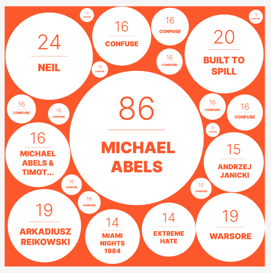
but I feel that there are too many circles and the fonts in the small circles are too small to read.
2022-10-21 29433, 2022
mayhem
I think it would be best to get rid of the smallest size of circles
2022-10-21 29412, 2022
chinmay
monkey: i tried the changehandler function. we don't need the offset height
2022-10-21 29446, 2022
lucifer
monkey: i think i got a way around the "path fuckery". instead of doing it in docker do it in webpack config :p it seems to work in light testing.
2022-10-21 29424, 2022
lucifer
will do more testing and let you be the judge of which one is preferable.
2022-10-21 29415, 2022
aerozol
mayhem: I actually added more circles because it looked crappy with fewer! But hopefully how your code puts it together looks nice than my manual arranging
2022-10-21 29457, 2022
mayhem
oh, a heh. I didn't think arranging them was my job. I thought it was going to be another template like the other one.